The best design is the simplest one that works.
Multimedia Designer With over 7 years of experience
Enthusiastic and innovative multi-media designer with 8+ years of experience in finding design, marketing and functionality solutions to complex problems and creating engaging visual written and strategic content across various platforms. Proficient in graphic design, animation, video editing, web development as well as an experienced marketing specialist with a strong understanding of branding and promotional stratergies. Adept at collaborating with clients to under-stand their needs and delivering high-quality solutions.
My Journey
Portfolio
Graphic design
Brief
The client was a newly established luxury wellness center located in a bustling urban area. They aim to create a logo that captures the essence of relaxation, rejuvenation, and exclusivity, appealing primarily to affluent professionals aged 25-45 who prioritize self-care and wellness.
Solution
Hot stones are commonly used in spa therapies to promote relaxation and alleviate muscle tension. They symbolize warmth, comfort, and therapeutic benefits. A leaf symbolizes growth, rejuvenation, and the natural environment. It represents the spa’s focus on holistic wellness and connection with nature. The blue colour was used to evoke nature and tranquility and the pop of pink is meant to reflect reflect warmth and relaxation.
Brief
The client asked for a logo that should convey a sense of craftsmanship, creativity, and joy. It should reflect our commitment to using high-quality ingredients and delivering cakes that not only look beautiful but also taste delicious.
Solution
It features a stylised cake tier adorned with delicate icing details, subtly reminiscent of a wedding cake. The tiers are designed to evoke a sense of elegance and artistry, reflecting the bespoke nature of our cakes. The dripping icing represents the delicious taste that makes you drool and creatively forms part of the letter “i” that is part of the businesses name.


Brief
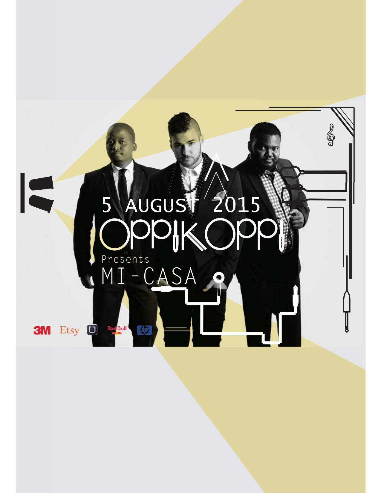
For the two billboard designs the brief was to create a billboard designs that effectively communicates brand messages to drivers and pedestrians passing by a high-traffic area. The goal was to capture attention quickly and convey our key message clearly within seconds.
Solution
For the design I went for a a sans-serif geometric typeface that aligns with the brand’s identity and the message they wanted to convey. Geometric fonts create clean lines and modern aesthetic, which can enhance readability and visual appeal on a billboard. I also Establish a clear hierarchy by varying font sizes and weights to emphasize key words and phrases within the headline. Lastly I use high-contrast colours for the text and background to ensure readability from a distance.
Brief
The client here started a new nails and beauty business named a Beauticious by MW. She said her target audience includes individuals who prioritize self-care and are willing to invest in quality beauty treatments. They are predominantly women of all ages, professionals, and fashion-conscious individuals seeking both relaxation and aesthetic enhancement. She needed an entire Corporate Identity for her business.
Solution
The CI for this business revolves around the concept of elegance, confidence, and a sense of fluidity. The logo features a stylized B that is incorporated in a ladies side profile and hair. Typography: We Chose a modern and elegant serif font for the business name. The typography is refined yet approachable, conveying professionalism and a sense of style. Color Palette: We utilised a sophisticated and calming color palette that includes shades of pink, pastel green and grey. These colors evoke a sense of luxury, femininity, and relaxation, appealing to their predominantly female clientele. Visual Style: Incorporates clean lines and minimalist design elements to maintain a sense of sophistication and clarity. The logo’s design should flows seamlessly, reflecting the smooth and precise nature of their nail and beauty services.

Brief
Brief 1: News Cafe
Design a Poster and Facebook Post Date: 12 October Time: 10 pm. Featuring: DJ Mo Flava see attached. Supported by: Ms Cosmo
No under 23’s/ Dress to Impress
Brief 2: Senhor Peri Peri
Design a Table Talker that is A5. Buy and Full Chicken, salad and large side for 79.90. Ts and Cs apply
Solution
For the design I went for a a sans-serif geometric typeface that aligns with the brand’s identity and the message they wanted to convey. Geometric fonts create clean lines and modern aesthetic, which can enhance readability and visual appeal on a billboard. I also Establish a clear hierarchy by varying font sizes and weights to emphasize key words and phrases within the headline. Lastly I use high-contrast colours for the text and background to ensure readability from a distance.

Brief 1

Brief 2

Design Problem
I needed to create a magazine editorial and fit all of the content onto one page.
Solution
The layout utilises a 3-column grid with generous whitespace, allowing each feature to breathe. Serif fonts are used for body text, providing a classic feel, while sans-serif headline in In a bold Italic size create visual interest. The image images builds a structure and focal point. The color palette of contrasting colours makes it easy on the eye and declutters the already content full page.